Creative Jam Phoenix 2018: the Good, the Bad, and the Ugly
Last April, I had the pleasure and the pain of being a contestant at Adobe Creative Jam here in Phoenix. Adobe Creative Jam is a designer's chance to participate in a hackathon-like experience. For those of you who are unfamiliar with hackathons, it's a way to both torture and challenge developers in a time crunch to prototype a minimum viable product (MVP). In a nutshell, a small team is expected to create a working mobile app from the ground up in a finite amount of time -- anywhere from a few hours to a few days. Sounds fun, right? My dumbass thought so.
"But Kat, what does this have to do with Adobe Creative Jam?" I'm getting to it, GAWD. Anyway, last April I competed in a creative version of a hackathon called Adobe Creative Jam. Instead of coding an app, however, we were challenged to come up with, design, and then "prototype" our designs in Adobe XD in 3 hours 😱. (Some of you may remember my angry moth noises surrounding the direction Adobe was taking with Photoshop and XD.) That's the overarching concept, but I'll take you through the process:
1. On Arrival
You better have a working computer with Adobe XD installed because Adobe sure didn't provide any computers. I really shouldn't complain too hard about this. This is typical for any hackathon. Adobe was kind enough to give us post-its, pens, tacos, and a boatload of beer. Adobe if you're reading this, I know we've had our disagreements, but at least you feed me beer, so we're cool.
2. The topic
Here was the crazy bit in this competition. We weren't given a direction before arriving; we just knew we would be prototyping an app in Adobe XD. Gulp. Our topic ended up being "It's gettin' hot in here." Um, what? I was expecting something like "create an app that helps people litter less on the light rail." Nope. This may be surprising, but having a broad topic made it much harder than having a specific challenge. The sky was the limit, and we hit the ground running with ideas.
3. Brainstorming
Did I mention having a broad topic is harder? My partner, the marvelous Toby Riley and I furiously took pen to paper and used our differing brainstorming techniques. I used the brain-dump method which means just writing down anything that comes to mind, even if it doesn't make sense. Just get it all out on paper, girl. Toby took a more structured approach with mind mapping. Mind mapping is a great brainstorming approach where you branch out ideas from the starting idea.This might sound like a first-world problem, but we had too many good ideas. Our ideas ranged from a flashmob water balloon organization app to a game about how to escape hell. We had to be cutthroat with our thoughts to start widdling them down. We started using a litmus test for the idea that had the most legs. 1. Did we have the creative assets to execute? Illustrations? Photography? 2. Does it sound like something we've heard before? How unique is it? 3. Is it doable in the time crunch? After narrowing our ideas down to two, we started sketching wireframes, and it began to become clear which idea had the most legs.I should mention while all of this was happening, we were sitting in the middle of the event with colleagues, friends, and event spectators milling around us clamoring for tacos and peeking at our work as we tried to restrain the panic of the clock ticking down. Time moves fast, y'all! I felt like Tim Gunn was going to show up, shake his head, and tell me to "make it work!"
4. Wireframing
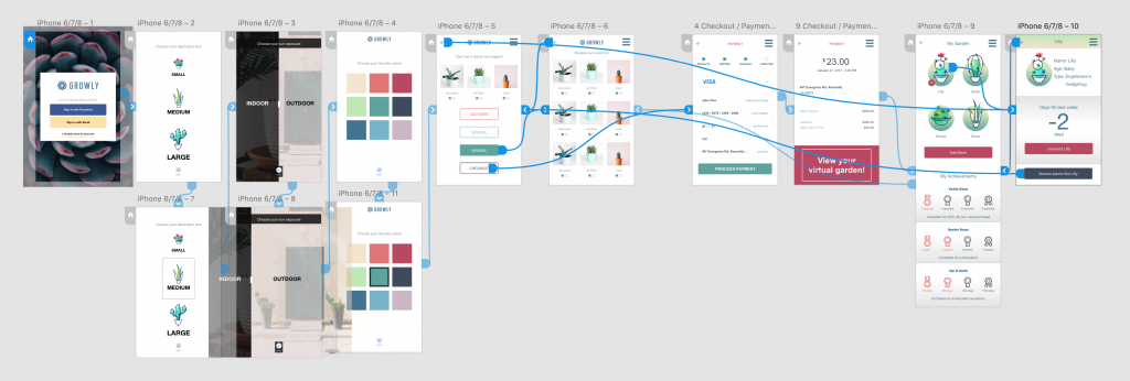
We decided to create an e-commerce app for succulents. (Get it? It's gettin' hot in here and succulents like the heat? Eh, we thought it fit.) This was no basic bitch e-commerce app experience, though. We added in a gamification piece after a user checks out. The user gets a virtual garden where she can see illustrated versions of the succulents she's purchased through the app, start earning achievements, and get alerts when she needs to water her little plant babies. Confident with our direction, we were off to the races with our shiny brainchild.We started sketching out the e-commerce experience from start to finish. The user begins with an onboarding -- selecting colors, environment, and size. Then flowing the user into a typical e-commerce experience, pick a plant or three and checkout. Oh yeah, we were cooking. That is until we looked up and noticed we had already burned through half of our time. Oh. Shit. So we called an audible. Divide and conquer. Toby took the wireframes we already sketched and started breathing life into them. Selecting a color scheme, finding photography and iconography, and plugging it all into Adobe XD. Meanwhile, I took the task to finish out the most complicated piece of the app idea. The gamification piece.
5. Prototyping
Once we finished with our respective tasks, it was time to plug our designs into Adobe XD. This ended up being the easiest part of the competition, Adobe XD is far from perfect but makes it super easy to point which button takes you to which page. At this point, we were sweating bullets. We still needed to package up our files and submit before the buzzer. We made it, but just barely.
6. The presentation
After a quick run-through with my partner, we were plopped up in front of the event-goers and presented our grand idea: Growly, the succulent e-commerce experience. We ended up killing the presentation, and I can thank a few things: rehearsing beforehand, sharing the presentation load (Toby, if you're reading this, you are an angel), and the most critical piece: the two beers I had frantically sucked down while panic-designing.
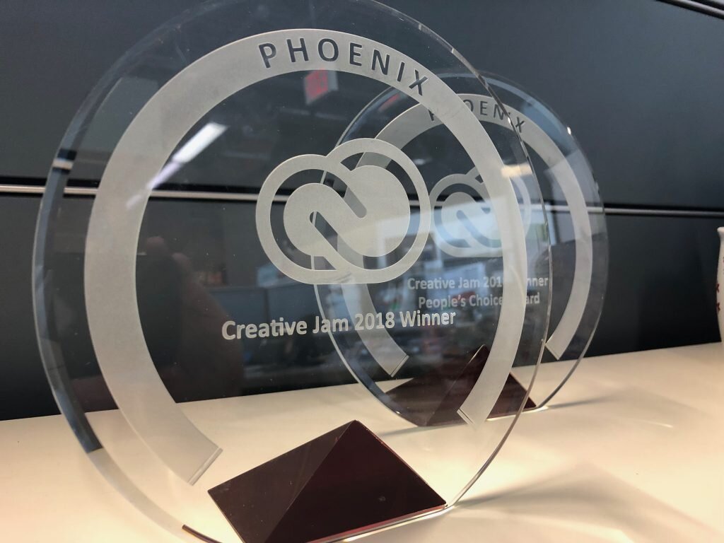
7. The resultsIt turns out they like us! They really like us! We ended up winning both the people's and the judge's choice. All in all, it was a great experience, and I was extremely impressed with the level of creativity and execution everyone was able to do in just three hours. Thanks for the experience, Adobe. Oh, and thanks for the beer and tacos.


