Rising web design trends in 2017

I like to find inspiration anywhere I can find it. Nature, people, a stroll down a city street, anywhere. But I think I can speak for most web designers when I say the primary source of inspiration is the internet. There are so many brilliantly talented designers and developers out there that I find myself intimidated when I check sites like Awwwards.com and CSSDrive.com.
However intimidating it may be, it still is a valuable well of inspiration and vision. Therein lies the problem. Web design starts to become templatized.
When tweets like this resonate so much, you know we have a creative problem:

While I'm seeing us break away from these trends, I'm starting to see new trends emerging.
1. Playfair all the things!
With the introduction of Google fonts in 2010, web designers everywhere sang a resounding "Hallelujah!" Finally, we had fonts we could play with that weren't the dreaded List.
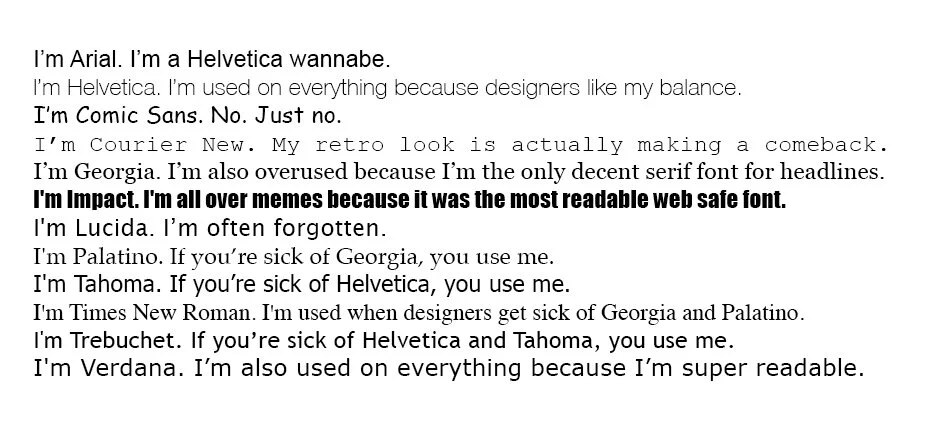
Now that we have so many beautiful typefaces to play with, of course, we're going to gravitate towards the fonts with the most weights available and the most beautiful. Then, boom, Playfair Display, look at the use of this lovely font:
Does it work on these designs? Absolutely! Is this a problem? Maybe. We as designers tend to play with things till they break. The same typeface starts to show up everywhere, and people naturally get sick of seeing it. Let's not break our shiny Playfair typeface.
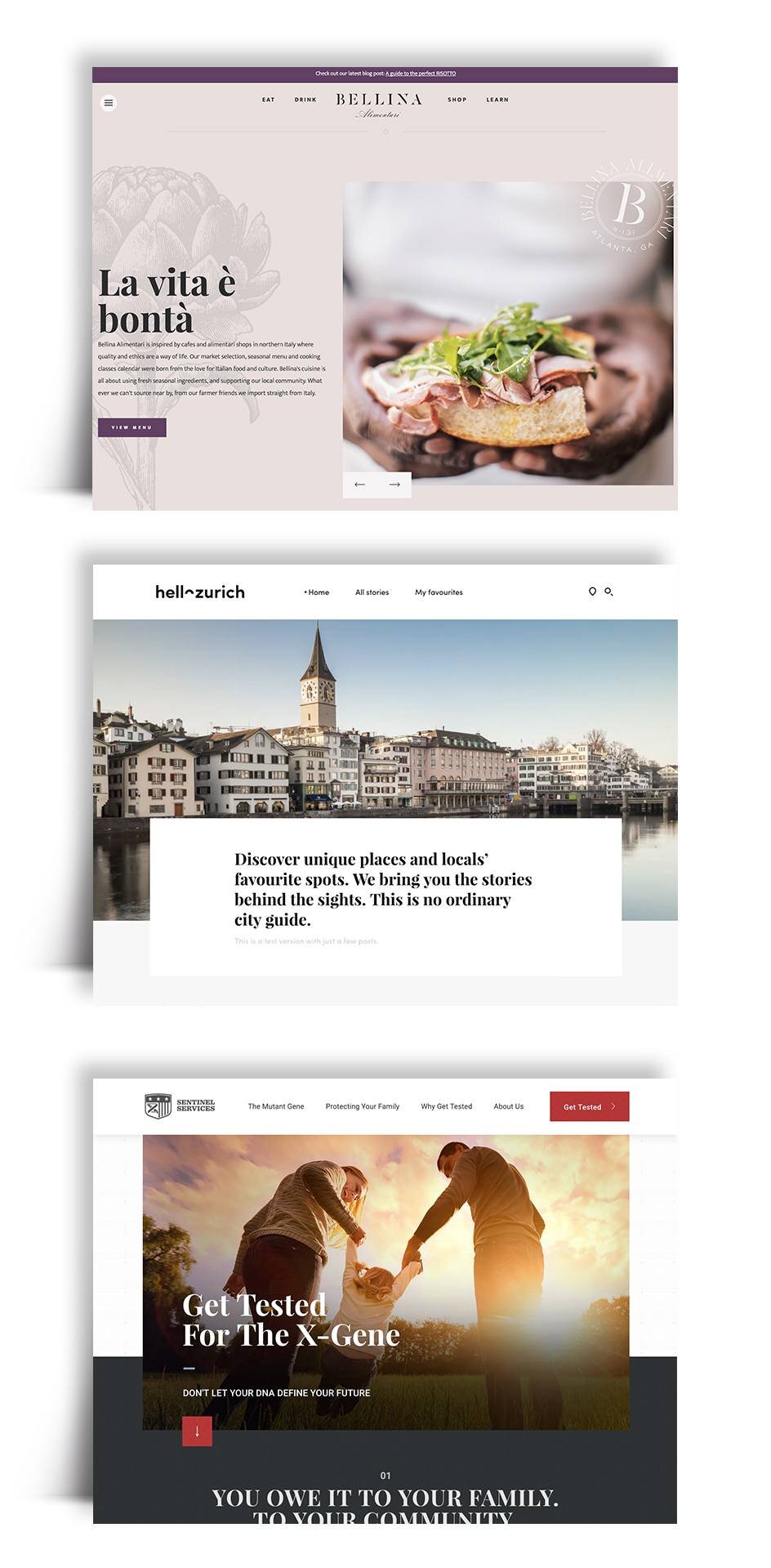
2. Put an image in a floaty box and overlap it with type.
Edgy, right? There's an interesting tension that is happening, and I love it. We're starting to break free of the grid and tap into our inner print designer:
Again, are these examples beautiful? Definitely. Problem? Again, maybe. The point to this new, modern edginess is it's NEW. Instead of playing with new ways to be modern and edgy, we relax into a design style that we know works rather than pushing the boundaries ourselves.
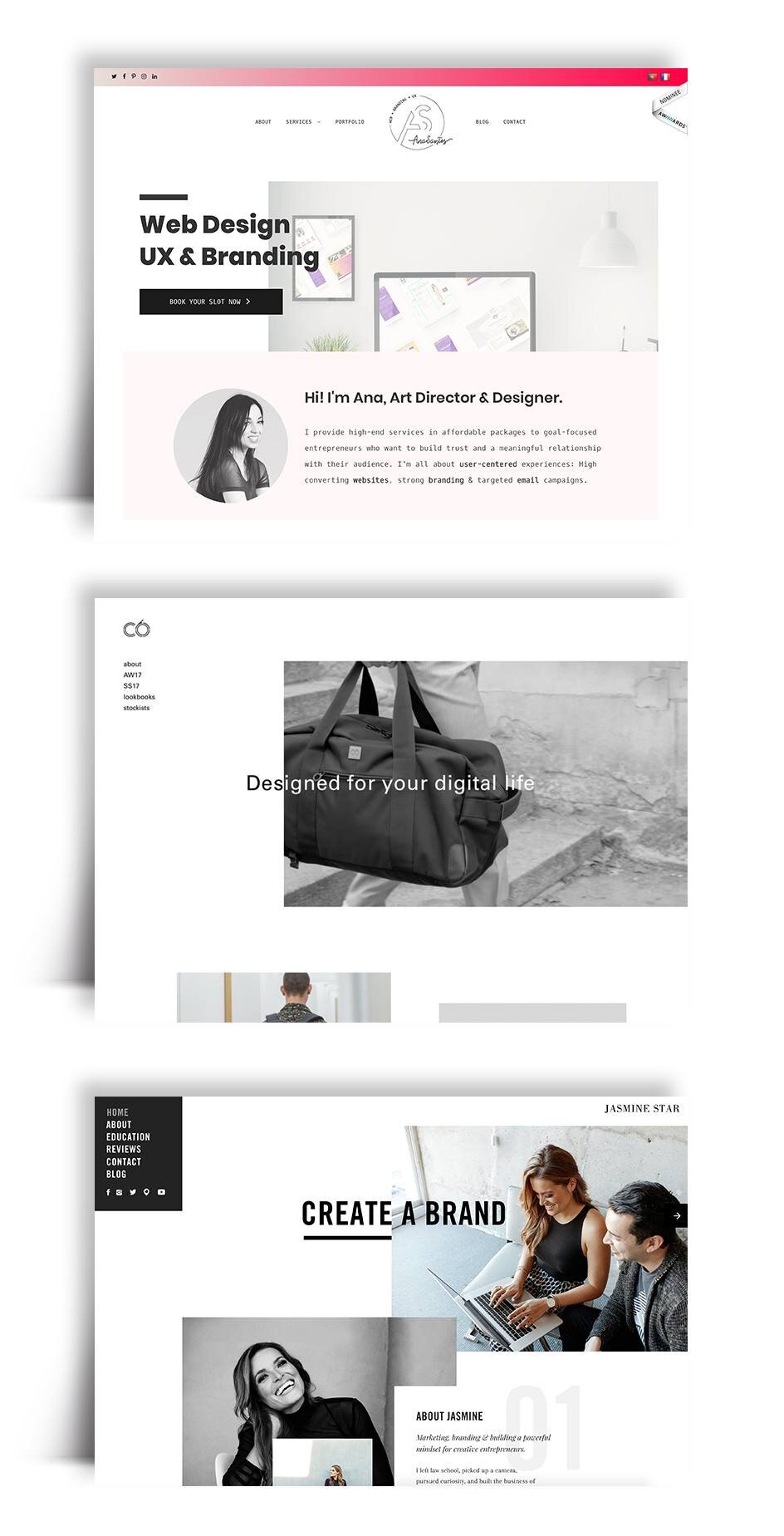
3. Gently float content up as you scroll.
Microinteractions? Um, yes, please. Adding subtle animations to a website makes it feel complete and friendly. The problem I'm seeing is animation is starting to get repetitive. How often have you seen this animation?
My point with all of this isn't to shame these sites; these are all beautifully designed sites. The point I am trying to make is let's not get stuck! Let's use these trends to inspire us and move above and beyond it.
Disagree with me? Have you noticed other overused design patterns? Share your thoughts in the comments.